Modern Minimalist Lighting Styles
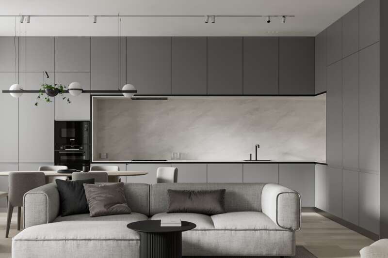
Clean lines, limited color and no clutter. That’s what it takes to achieve a minimalist design. If you’re heading this direction for an upcoming commercial space design, you need to make a bold statement with bare visuals.
Incorporating Natural Light
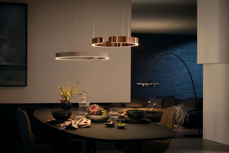
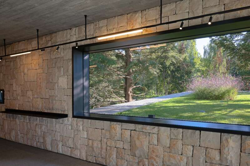
The most impactful way to kick off your minimalist lighting design is to pull in your external resources. Find the natural light first and use it to your advantage. Architectural details like floor-to-ceiling windows make any space feel bigger. When paired with minimalist white walls, your natural light reflects throughout the space for an even more open feel. If the naturally lit space is large enough for an oversized decor element, seize the opportunity to incorporate a unique or even custom lighting piece as the decor. Your light fixture can become more of an artistic feature rather than bearing a functional or task lighting responsibility.
Recessed Lighting
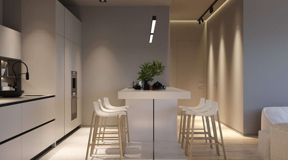
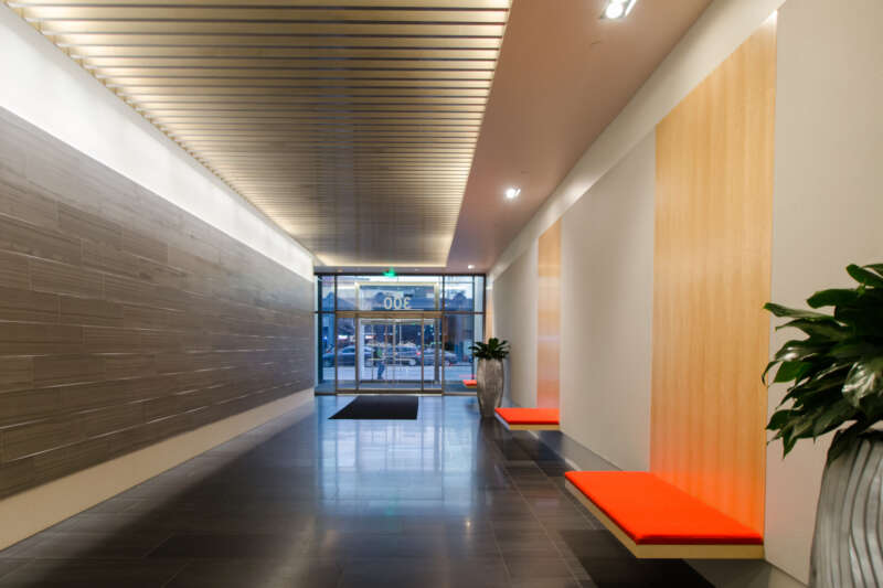
Modern minimalist design calls for crisp lines and subtleness. A smart way to achieve both is by accenting straight lines in walls, furniture, or other permanent fixtures with recessed lighting. Indirect, recessed lighting along the ceiling is a natural alternative to crown molding. You might also choose to use it behind mirrors or large furniture, even along a hotel or office hallway floor. Usually, the color scheme for minimalist design includes just white tints and black for contrast. That said, indirect recessed lighting could be a playful way to tailor your design to your client’s brand. Pick a primary color from the brand color palette, and use recessed lighting to build it into a retail store entryway or the logo display in a boardroom.
Wall Sconces
When choosing lighting to compliment simple and streamlined design elements in the minimalist family, stretch your boundaries and don’t just settle for a hanging light overhead. Break up white space with a mixed-metal wall sconce. The colors will stand out against softer neutrals and the height of sconce may make the space appear taller. Create additional interest with a swing arm or play with sconces in varying heights and sizes.
We often see plenty of sconces in hotel design near the nightstands, but don’t rule them out for flanking bathroom mirrors, subbing for recessed ceiling lights in yet another corporate office hallway, and other applications. Sconces also offer an opportunity to try out a new design aesthetic before investing in furniture and other bigger budget materials. Good design isn’t limited to interiors. Use a well-placed sconce or two outside to help set your design tone.
Lighting as Focal Point
If “less is more” in modern minimalist lighting, how is it possible to elevate lighting as a focal point? Use broad, bright lighting for a maximum impact. Better yet, craft your space around architectural design elements on the floor or in the ceiling.
While minimalist design calls for neutral color schemes and clean lines, architects may choose to personalize commercial spaces with brand colors or shapes. Indirect lighting makes a dramatic statement around logo signage or photography, and the scale of these elements together will set a specific mood. The right pedestal and mirror combination, your retail lighting choices will even make a customer feel like the star of that space. Some focal points come to life behind the scenes.


